Using Overlays to Enhance the Neighborhood Change Web Map

The Neighborhood Change Web Map (NCWM) allows users to select census tracts generating a graph that displays longitudinal information about those tracts.
Alexander Din, Social Science Analyst, Office of Policy Development and Research
Todd Richardson, General Deputy Assistant Secretary, Office of Policy Development and Research
The Neighborhood Change Web Map
Released in 2023, the Neighborhood Change Web Map (NCWM) improves access to and interpretation of Office of Policy Development and Research (PD&R) data, particularly U.S. Postal Service (USPS) Vacant Address Data and data on households participating in HUD's low-income rental assistance programs. Instead of compiling data from multiple tables to generate insights, map users can select census tracts that are neighborhood approximations to generate a graph displaying longitudinal information about those census tracts. This tool has garnered interest from city and state officials, public housing agencies, nonprofits, federal partners, and others wishing to understand changes in small geographies.
Overlays
The NCWM is a query selection tool. Users select census tracts on the map, and the tool displays the data about those tracts as a graph. Unlike most other maps, NCWM is not stylized when the map is initialized. To help guide the data selection process, NCWM offers optional overlays to stylize the map to direct users to areas of interest. The first set of overlays are part of the Economic Development group, which includes several place-based initiatives and a layer showing the growth and loss of housing units since the 2020 decennial census.
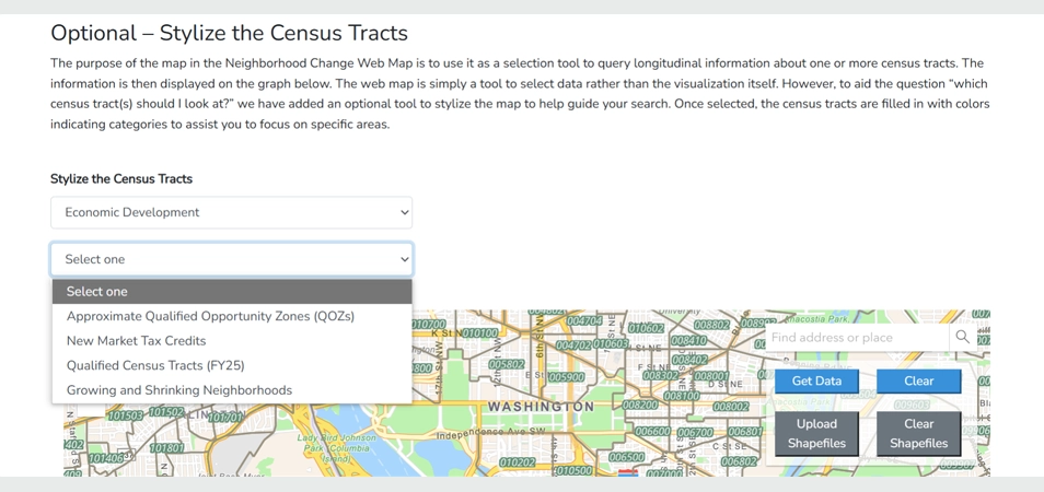
Selecting an overlay on the NCWM is simple. From the first dropdown menu, map users select an overlay category, such as Economic Development (figure 1). From the second dropdown menu, map users then select a specific stylization. For the Economic Development group, the options are Approximate Qualified Opportunity Zones (QOZs), New Markets Tax Credit (NMTC) areas, Qualified Census Tracts (QCTs), and Growing and Shrinking Neighborhoods since the 2020 Decennial Census.
Figure 1. Selecting an Overlay
Qualified Opportunity Zones
The first overlay to stylize the map identifies census tracts that are designated as QOZs, an economic development tool that allows investment in distressed communities to spur economic growth and job creation while providing tax benefits to investors. Opportunity Zones were created under the Tax Cuts and Jobs Act of 2017 (Public Law No. 115-97). Early analysis of QOZs found that most investments involved real estate. The NCWM allows users to view exactly that change — the growth of households within a small geographic area.
Note that the NCWM identifies approximate QOZs, because QOZs were determined using 2010 census tracts, whereas the NCWM map uses 2020 census tracts. Although 85 percent of the 8,764 QOZ census tracts remained unchanged between the delineations (85 percent), some were split into more census tracts (13 percent) or merged with other census tracts (2 percent). The Internal Revenue Service, which manages the Opportunity Zone program, has stated that even though some designated Opportunity Zones are in census tracts altered by the 2020 decennial census, these new boundaries are not adopted by the designated Opportunity Zone census tracts.
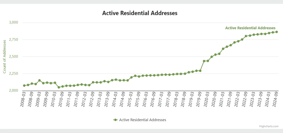
Figure 2 shows two QOZ-designated census tracts near central Fort Worth, Texas. NCWM identifies QOZ tracts by shading them in green. Selecting these two tracts and choosing the Get Data option displays the full range of data for these tracts. For example, the tool's secondary data menu can display American Community Survey (ACS) data for the two tracts, illustrating poverty rates above 40 percent since the 2008 to 2012 ACS. NCWM also reveals that the two tracts saw modest growth in active residential addresses in the decade leading up to QOZ designation, but the addition of nearly 600 households since 2019 highlights a remarkable acceleration in development (figure 3). The NCWM cannot state for certain that the increase in the number of households in the census tract is because of QOZ funds; however, it can provide a quality starting point for further analysis.
Figure 2. Census Tracts Near Central Fort Worth, Texas
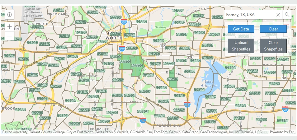
Figure 3: Active Residential Addresses for Fort Worth QOZ Tracts
Growing and shrinking neighborhoods since the 2020 census
Another helpful overlay helps users easily locate growing and shrinking neighborhoods since the 2020 decennial census. Included are census tracts in which the number of USPS residential addresses actively receiving mail (USPS households) was within ±10 percent of the number of occupied households recorded in both the 2010 and 2020 decennial censuses. These tracts represent 65 percent of all census tracts in the NCWM.
Nearly half of the census tracts within the threshold have ±5 percent the same number of households as they did during the 2020 decennial census. This is unsurprising because most neighborhoods are stable, and a lookback period of less than 5 years is not long enough to reveal significant neighborhood change.
Few census tracts experienced a decline in households. Approximately 1 percent of tracts lost between 6 and 15 percent of their households, and an even smaller share (0.1 percent) lost more than 15 percent of their households, with the largest reduction being approximately 50 percent.
Many census tracts have grown since 2020. The well-documented housing supply shortage and resulting increase in home values and rents have spurred significant housing development since 2020. The NCWM can help users locate that growth. Since 2020, approximately 13 percent of census tracts added between 5 and 15 percent more households, nearly six percent of census tracts grew between 15 percent and 99 percent, and 0.16 percent of census tracts (132) more than doubled the number of existing households. Some areas of the United States, particularly exurban areas and a few urban centers, have grown tremendously since the most recent decennial census.
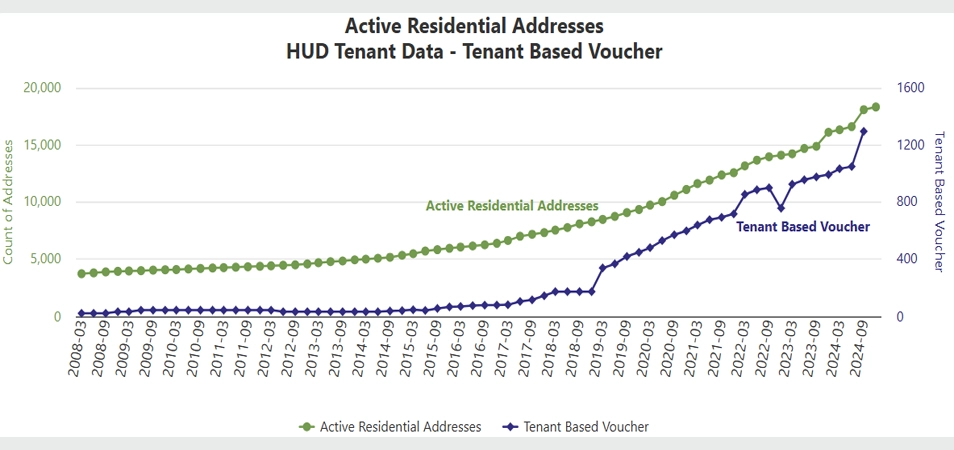
Figure 4 displays three census tracts around Forney, Texas. Although many high-growth census tracts exist nearby, these three census tracts are significant because their growth has also included an increase in the number of households using a tenant-based voucher (figure 5). In the third quarter of 2020, USPS data and decennial data counted 9,744 and 9,704 households, respectively. By the third quarter of 2024, the number of USPS households nearly doubled to 18,904. Further investigation of the area using HUD tenant data revealed that the number of households using a tenant-based voucher grew from 482 (4.9 percent of all households) to 1,296 (6.8 percent) by the third quarter of 2024. An investigation of the area using Google Maps' Street View showed recent construction of single-family detached homes in good condition.
Figure 4. Neighborhood Growth and Decline Since 2020, Forney, Texas
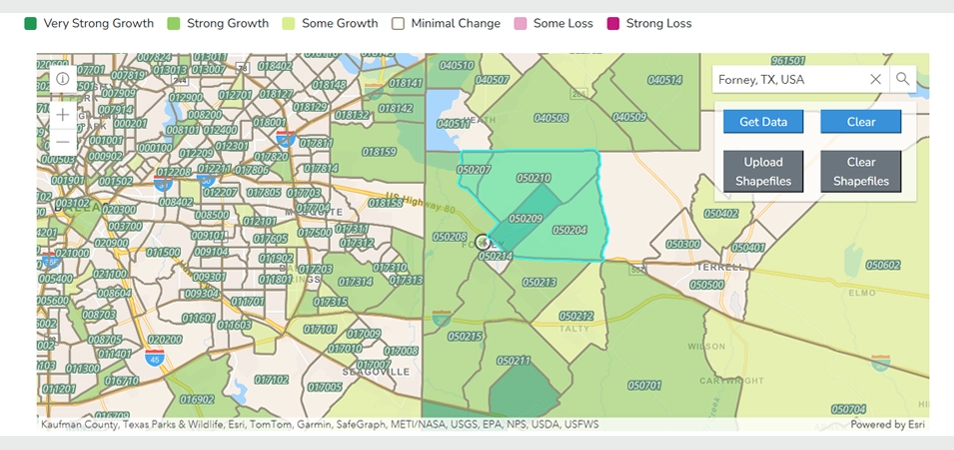
Figure 5. Growth in Active Residential Addresses and HUD Tenant-Based Vouchers, Forney, Texas
The data for the growing and shrinking neighborhoods overlay were calculated using USPS data for the third quarter of 2024. These data will be updated once more following the data release for the first quarter of 2025, serving as a mid-decade review. Further data updates to this layer are not anticipated.
Other Economic Development Map Overlays
The other overlays to stylize the NCWM under the Economic Development group are QCTs, which are used for designations for Low-Income Housing Tax Credit (LIHTC) development and NMTCs, which are used to encourage investment in low-income communities. These layers are useful for those interested in neighborhood change where affordable housing construction could occur through QCTs or other place-based investments into businesses through NMTCs.
What's Next?
PD&R will continue to update the NCWM. After March 31, 2025, PD&R will update the growing and shrinking neighborhoods overlay to the first quarter of 2025 to reflect a true mid-decade review of household growth and shrinking. If you have thoughts, comments, or questions on the data presented here or in the NCWM, please contact Alex Din at alexander.m.din@hud.gov. If you have ideas for other layers that could neatly be displayed and allow meaningful interaction with USPS-HUD data or HUD tenant data, please also let Alex know.
